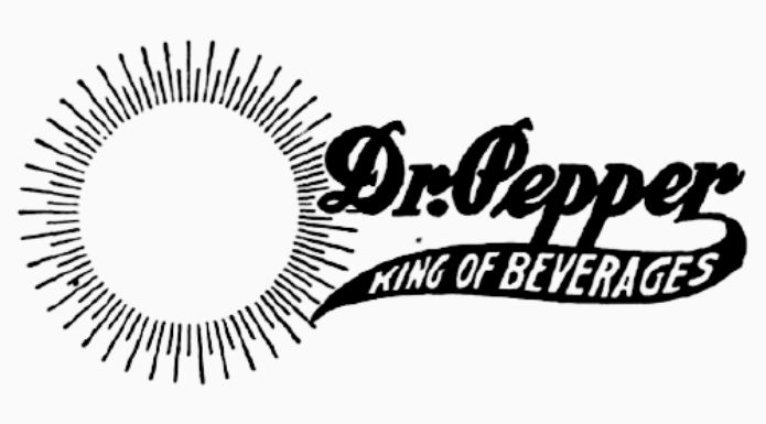
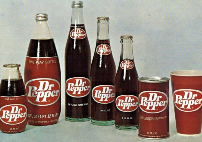
If you read the article about who invented Dr. Pepper, you may notice that I neglected to put a period in Dr. throughout the article. I wrote, Dr Pepper, not Dr. Pepper. I did so while realizing that some people may think I was making a grammatical error. But as you may have noticed, and wondered about, there is no period in the Dr Pepper logo. Why not? The truth is that Dr Pepper did have a period in it for over 70 years. The period was removed from the logo in 1950.

There have been some fanciful explanations as to what happened to the period after it was used for decades. One such explanation is that, after much consideration, the period was removed to avoid confusion about any medicinal effects the soda might have. In other words, the brand wanted to dissociate itself from the early claims of medicinal effects, so the period was removed. This explanation, of course, makes no sense. Removing the period from “Dr.” in no way would make customers think the Dr meant something other than doctor.
The real truth has to do with a bad choice of letter style, or font, used in early logos. Look at the old Dr. Pepper lgoo above. This was part of the logo from an advertisement. Pay particular attention to the ‘Dr.’ part. This was not much of a problem in more clearly printed logos used on official signage or labels. But advertisements often had more blotchy printing, which made the font a poor choice. See how the font makes the ‘Dr. Pepper’ look more like ‘Di:Pepper.’
After much debate over the problem, the company decided to simply drop the period rather than change the letter style. Since then, the font has been changed, but the period is still missing.
The ‘Di:’ problem was not always an issue. The first Dr. Pepper logos were created in the 1890s, in the days when Dr. Pepper was called Dr. Pepper’s Phos-Ferrates. One early logo created by Waco artist Nellie Eastland Kellner, featuring wheat fronds and an anvil, used an all-caps font, something that was repeated even in early versions of the Dr. Pepper only name. Other early fonts used an ‘r’ that was clearly distinguishable even when a period was used. The current logo might look fine with a period after the ‘Dr,’ but once the period was removed, the company never saw fit to put it back.


